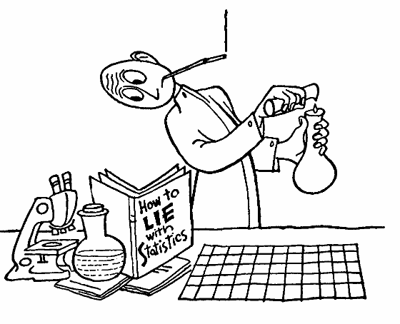
This is the best of times and the worst of times: both the power and corruption of statistics are daily on display. This is not new: Darrell Huff's book How to Lie with Statistics (Norton, 1954) attempted to expose the tricks of the statistical spin-doctors for the "self-defense" of "honest men". In 1883 (Life on the Mississippi p.120), with tongue firmly in check, Mark Twain wrote:
There is something fascinating about science. One gets such wholesale returns of conjecture out of such a trifling investment of fact
Since the eye is a "fat pipe" to the mind, that is, since a great deal of (mis)information can be quickly communicated visually, the (im)proper display of statistics offers a fast track to selling ideas, and potentially to lying with statistics. Thus I see the greatest abuse of statistics when I see them graphically displayed. (Nevertheless the majority of the book How to Lie with Statistics deals with non-visual distortions of statistical data.)
These pages assume that your aim is simple and accurate display of statistical information mostly for yourself (as part of doing experiments), but perhaps also for your scientific peers. Illustrators working in public relations or for a general readership publication like USA Today often have different aims and audiences in mind. My bias for display is plain and simple, which conveniently matches what is easy to make, what is part of the standard scientific visual vocabulary, and what journals are willing to publish. Do not be mislead: Simplificy is not a foolproof tonic against distortion (in fact many striking optical illusions are quite simple), and "standard practice" has hidden many important phenomenon. For a much more complete discussion of visual display see the works of Edward R. Tufte or, for example, Elements of Graph Design by S. Kosslyn.
Everything should be made as simple as possible, but not simpler
Albert Einstein
With production of nice drawing programs like Adobe Illustrator, we can all make diagrams similar to those in chapter 6 of How to Lie with Statistics:
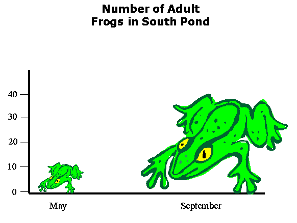
Presumably this graph shows that there were a bit more than 10 frogs in May and something like 40 frogs in September. However, because the frog picture is not regular (and lacks clear and distinct start and stop points) it is impossible to read precise values from the chart. (My best measurement on this chart finds 11.6 frogs in May and 38.2 frogs in September.) At face value the chart suggests that frogs were simply bigger in September than in May... The title may correct that false impression, but still leave the impression of a much bigger change. The frog on the right is about 3× longer and 3× wider than the frog on the left and hence takes up 32=9 times more area (and presumably the eye judges 33=27 times more mass and volume). Thus this sort of diagram leaves the viewer with a distorted view of the actual data: a change much larger than a factor of 3.
We can be a bit more accurate with a "stacked-frog" plot:
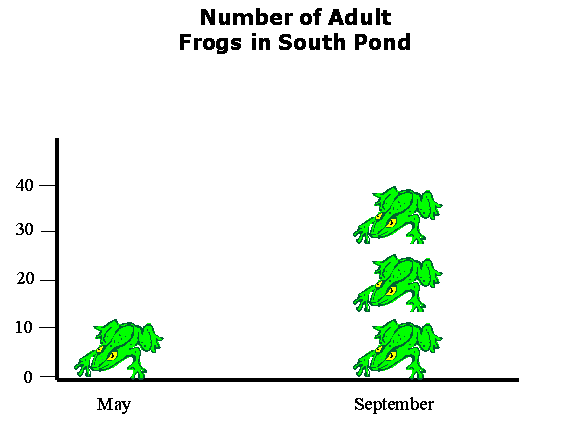
Now it is clear that there were something like 3 times more frogs in September than in May. Of course, it is unlikely to have been exactly 3 times more frogs... a confusing fractional frog will generally be required. If your aim is accuracy rather than art, your proper display choice here is an old fashion bar chart:
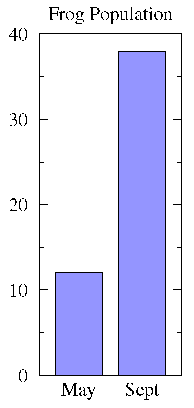
The purpose of a bar is to put the raw numbers into perspective. This purpose is thwarted if a truncated scale is used:
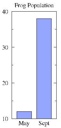
Truncated scales are the topic of chapter 5 in How to Lie with Statistics. I believe it is never fair to use truncated scales on bar graphs. On the other hand, sometimes you will feel that a small change is significant and that accurate display of the statistic requires clearly displaying the change. (Examples: A small increase -- say 5% -- in the volume of the oceans would mean an almost total loss of important coastal regions. A small decrease in species -- say 5% in a decade -- extrapolates to a major extinction event over a century.) If you feel you must use a truncated scale, consider using a line graph, where truncated scales are more expected. However, any use of truncated scales leaves you open to the charge of trying to Lie with Statistics. Huff cites with approval Time magazine's use of both types of graphs in ambiguous cases.
I have no idea how the frog populations were determined. It is possible that this was done by complete enumeration, for example, by draining the pond and counting each and every frog. In this case the values are precise. However, it is also possible that the frog populations were estimated for example by re-capture ratios. Estimated populations have standard uncertainties (a.k.a. errors) which should be displayed with an error bar.
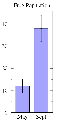
Note that there really isn't a standard meaning for the size of an
error bar. Common choices are: 1 (the range
would include about 68% of normal data), 2 which is
basically the same as 95% limits, and 0.674×
which would include 50% of normal data. The above
may be a population standard deviation or a standard deviation of the
mean. Because of this lack of standard practice it is critical for the
text or figure caption to report the meaning of the error bar.
(the range
would include about 68% of normal data), 2 which is
basically the same as 95% limits, and 0.674×
which would include 50% of normal data. The above
may be a population standard deviation or a standard deviation of the
mean. Because of this lack of standard practice it is critical for the
text or figure caption to report the meaning of the error bar.
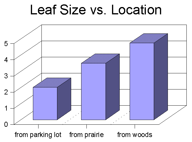
Dilbert invented 3D bar graphs as a joke. Unfortunately his boss liked them and now we're stuck with them. 3D bars simply make the data harder to precisely evaluate and easier to distort. Don't ever use them (unless you have a boss as dumb as Dilbert's).
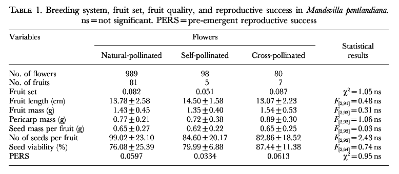
Tables of data, while not as immediately comprehensible as graphs, are a precise form statistics display. Here are a couple of examples of tables from scientific papers:
Botanical Journal of the Linnean Society (1999) 129 187-205
Ecology (1996) 77 2302-2311
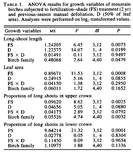
One of the first things you need to decide in making a table is the number of significant digits to display. If a value has a known "error" (e.g., standard deviation, standard error), it is inappropriate to display digits that are well within that error. For example, the first table reports natural-pollinated seed viability as 76.08±25.39. This should have been reported as 76±25; the .08 is totally irrelevant if the range of variation is 25. (It is almost never useful to report more than 2 significant digits of an "error".) If the base number lacks a statistical error, the number of digits reported is often determined by the accuracy of the measurement. Thus masses measured with an analytical balance might be displayed with more digits than masses measured with a triple beam balance. Only rarely is it useful to record more than 4 significant digits. (An astronomical exception: stellar locations are often measured and recorded with extreme precision, say 10 significant digits, because of the importance of unambiguous identification of one object among billions. I'm sure each discipline has such exceptional cases.) One must, of course, report the units of the number. The second table has a tricky case, generally mean squares ("MS") have units, however because of the magic of the logarithm, the units used in this log-transformed MS actually will not effect the value of the mean square, and it is properly reported without units. (F, d.f., and P are all unitless.) It is rarely useful to report more than 2 significant digits of P values or values less than .0001 (probabilities that small are certainly dominated by other effects like human blunders in recording data or an assumption of approximate normalcy). The second table often displays more than two significant digits of P as it is trying to follow another rule of table construction: line up the decimal point in vertical columns of related numbers. The display would have been more effective if the insignificant digits had just been left as blanks. The first table shows that "ns" (not significant) results are still worth reporting. Note, however, that terms like "not significant" do not have a precise mathematical meaning -- different people and disciplines have adopted different standards. Be sure to define in the text or table caption what you have adopted as a definition for significant.
Some miscellaneous formatting details: Note that the table lacks vertical lines, typically is placed at the top or bottom of a page (it does not interrupt the text), has a label ("Table 1." in these cases) and a caption. Feel free to include each table and figure on a separate sheet of paper attached to the end of your paper. Similarly on the web, popping up a separate browser window that just contains tables and figures is a nice option.
Note that readers of scientific papers often look first (and perhaps only) at the figures and tables: the information density is usually highest there. If the tables and figures prove interesting the rest of the text may be browsed for additional nuggets of information. The upshot of this for you is that many (most?) of your "readers" will judge the value of your paper solely from the tables and figures: you should concentrate your efforts on making these particularly informative and, if possible, understandable with out reading the text.