 .
.
In our time it is easy to show a positive correlation between any pair of things...How to Lie with Statistics by Darrell Huff (1954)
Click here for least squares data entry with plot option
If you go into a forest you find yourself surrounded by many types and sizes of trees. If you consider just one species of tree a natural assumption is that the largest trees are the oldest. While we expect that there is a correlation between the size of a tree and its age, the relationship between between these two variables is probably not exact: you would expect that genes and environment would also play a role. A tree that happened to have access to more light or better soil or proper moisture or whose parents were unusually large will probably grow more per year than a less "lucky" tree. Furthermore, not all years are the same: we expect trees to grow little during years of drought. Even though we expect that each individual tree has its own growth history, we expect on average there will be a relationship between tree size and tree age.
The age of a tree can be determined by counting each annual growth ring
in the trunk of the tree. (You need not convert the tree into
a stump to count these growth rings: a thin core of wood -- reaching
from bark to dead center -- can be extracted
from a living tree using a borer.) A common measure of the
size of a tree is the "diameter at breast height" DBH.
"Breast height" is defined as 4 ½ feet above the uphill
side of the tree. Since a tree trunk is not a perfect circle,
"diameter" is defined as the circumference divided by
.
Note that the DBH of a tree is easy to determine: it just takes a measuring tape whereas the age of a tree requires specialized instruments and additional work and time. This is one reason why it can be helpful to know the average relationship between size and age: we can then use an easy measurement (DBH) and some calculations to determine a hard-to-measure quantity (age). Of course, this easy measure of age is also only an approximate measure of age.
Consider the following data on 12 northern red oaks from an unthinned stand in southwestern Wisconsin:
| Age (years) | DBH (inch) |
|---|---|
| 97 | 12.5 |
| 93 | 12.5 |
| 88 | 8.0 |
| 81 | 9.5 |
| 75 | 16.5 |
| 57 | 11.0 |
| 52 | 10.5 |
| 45 | 9.0 |
| 28 | 6.0 |
| 15 | 1.5 |
| 12 | 1.0 |
| 11 | 1.0 |
We can display this data in an x-y scatter plot. One of the first decisions that needs to be made is which variable (age or DBH) to put on the x (horizontal) axis and which on the y (vertical) axis.
One rule is to put the least precisely measured variable on the y axis. The counting of annual growth rings should be precise; of course the trees are probably a bit older than the count as it took a few years for the tree to grow to the height at which the core was taken. The DBH could have been measured to greater accuracy: the students were told to measure to the nearest ½ inch. The errors in age (a systematic understatement of age by a few years) and in DBH (roundoff error of ± ¼ inch) are difficult to compare since they have different units and different natures. If we compare them in percent terms using typical values (say 2 out of 50 years = 4% or ¼ inch out of 8 inches = 3%) the errors are similar.
Another rule is to put the "controlling" variable on the x axis and the dependent variable on the y axis. I think of age causing growth rather than growth causing age, so I would put age on the x axis.
On the other hand, if the aim of this process is to come up with a formula predicting age based on DBH then we must put age on the y axis.
The choice of which variable goes where is not just a matter of display: different "trendlines" will be generated by different choices. On the other hand the "correlation coefficient" r and its associated P value (see below) will not depend on this choice.
You can see below which choice I made (this time):
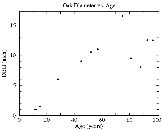
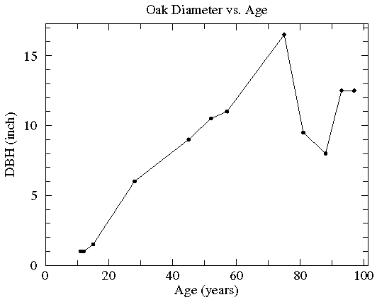
It should be clear that there is a general trend for the old trees to be big trees. On the other hand, there is a lot of variation: For example, the the biggest tree is not the oldest. I hope it is clear that the relationship between age and DBH is not that given by "connecting the dots". (It is almost always wrong to produce such "connect the dots" plots!).
On the other hand, the relationship between age and the average DBH, might be a smooth curve that misses individual data points (some high and some low), but instead hits some sort of average between the points like this:
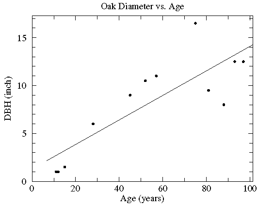
If we do a least squares analysis of the data the following results are reported:
y = a + bx where:
a= 1.29 ( a = 1.0 )
b= 0.128 (b = 2.11E-02 )
degrees of freedom = 10
r = 0.830 (p = 0.001)
We are given a line (displayed above) that represents an average
relationship between age and DBH
(the parameters that describe that line, the y intercept
a and the slope b are given along with estimates
of the expected range of variation
of each), and a
correlation coefficient, r, with an associated
probability p. The small value of p indicates
that is highly unlikely that the apparent relationship between
age and DBH came about by chance. Do not
be highly impressed by small p values: they are not uncommon
particularly in larger datasets. Instead focus on r, which will
always be between -1 and 1. The fact that r is positive
for this data indicates that larger age generally goes along with
larger DBH -- a "direct" relationship. If r is
negative more
x goes along with less y -- a
negatively sloping "inverse" relationship.
Values of r near zero indicate no particular relationship
between the variables.
It is often said that r2 is
the fraction of the variation in y that
is explained by its relationship with x.
What this means is the standard
deviation of the data's deviation from the trendline (the blue lines shown below)
divided by the the standard deviation of the y data is
1-r2:
1-r2 = (deviations from trendline)/(standard deviation of y data)
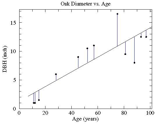
Clearly, if r is near 1 or -1, the deviations from the trendline must be "small".
Thus if r is near 1 or -1, there must be relatively small deviations from the line.
Please guard against the not uncommon situation of "statistically significant" correlations (i.e., small p values) that explain miniscule variations in the data (i.e., small r2 values). For example, with 100 data points a correlation that explains just 4% of the variation in y (i.e., r=.2) would be considered statistically significant (i.e., p<.05). Here is what such data looks like in a scatter plot:
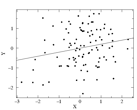
The correlation may be statistically significant, but it is probably not important in understanding the variation in y.
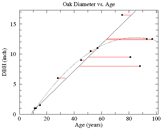
The solid line, which does a very good job matching most of the
data but leaves 4 points well off the line, is based on
minimizing the length of the horizontal deviations from
the line (shown above in red). It has a significantly steeper
slope than the least squares line (about
4½× b
more than the least squares b).
The dotted curve, which badly misses only 3 points,
is a parabola chosen to minimize the square of the
y deviations. There really is not a way of selecting
the best trendline from among all the possible trendlines.
You may be guided by the suggestions of known theory, by
the requirements of a particular instructor,
by standard practice (usually a
least squares line), by knowledge of which points are
most likely to be anomalous, or (unfortunately) by
a desire to produce a particular answer. The option to
push an answer onto the data -- to
Lie with Statistics -- comes from the relatively
large deviations seen in this data. If the relationship were
"tighter" all possibilities would be quite close.
Trendlines are often used just to "guide the eye": to display an average trend. They may also be used to make quantitative predictions. You can answer questions like "how big will my oak tree be in 20 years?" or "How old is this 10 inch diameter tree likely to be?". It is safest to use the predictive abilities of trendlines only within the range of the data that defined the trendline (this is basically interpolation). When used outside the tested range (extrapolation) trendlines may well give wrong or even crazy answers. For example the above solid line (with minimum horizontal deviations) suggests a 1 year old tree has a negative diameter. The parabolic trendline suggests trees actually start to shrink for ages beyond about 80 years and would have negative diameters when older than about 150 years.