Click here for box plots of one or more datasets
They are different, but not different enough to matter -- like the maple leaves off the tree in my yard, when all I want to do is rake them up.Roald Hoffmann, 1981 Nobel Laureate in Chemistry
from: The Same and Not the Same
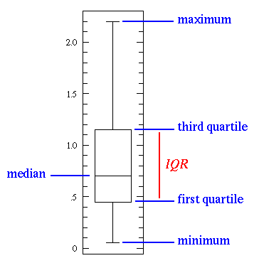
"The Same and Not the Same" is a short, accurate description of most any set of data...a pile of maple leaves for example. Maple leaves have approximately the same size, but with some variation. Descriptive statistics are an attempt to use numbers to describe how data are the same and not the same. The box plot (a.k.a. box and whisker diagram) is a standardized way of displaying the distribution of data based on the five number summary: minimum, first quartile, median, third quartile, and maximum. In the simplest box plot the central rectangle spans the first quartile to the third quartile (the interquartile range or IQR). A segment inside the rectangle shows the median and "whiskers" above and below the box show the locations of the minimum and maximum.
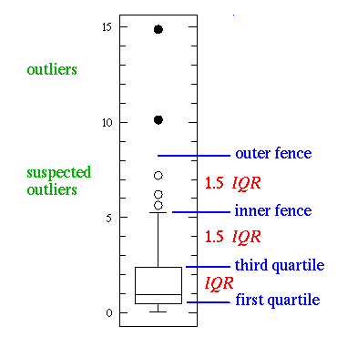
This simplest possible box plot displays the full range of variation (from min to max), the likely range of variation (the IQR), and a typical value (the median). Not uncommonly real datasets will display surprisingly high maximums or surprisingly low minimums called outliers. John Tukey has provided a precise definition for two types of outliers:
If the data happens to be normally distributed,
IQR = 1.35 σ
where σ is the population standard deviation.
Suspected outliers are not uncommon in large normally distributed datasets (say more than 100 data-points). Outliers are expected in normally distributed datasets with more than about 10,000 data-points. Here is an example of 1000 normally distributed data displayed as a box plot:
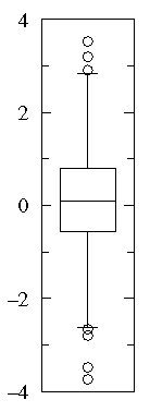
Note that outliers are not necessarily "bad" data-points; indeed they may well be the most important, most information rich, part of the dataset. Under no circumstances should they be automatically removed from the dataset. Outliers may deserve special consideration: they may be the key to the phenomenon under study or the result of human blunders.
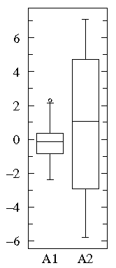
A1={0.22, -0.87, -2.39, -1.79, 0.37, -1.54, 1.28, -0.31, -0.74, 1.72, 0.38, -0.17, -0.62, -1.10, 0.30, 0.15, 2.30, 0.19, -0.50, -0.09}
A2={-5.13, -2.19, -2.43, -3.83, 0.50, -3.25, 4.32, 1.63, 5.18, -0.43, 7.11, 4.87, -3.10, -5.81, 3.76, 6.31, 2.58, 0.07, 5.76, 3.50}
Notice that both datasets are approximately balanced around zero; evidently the mean in both cases is "near" zero. However there is substantially more variation in A2 which ranges approximately from -6 to 6 whereas A1 ranges approximately from -2½ to 2½.
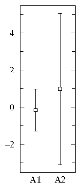
Below find box plots and the more traditional error bar plots (with 1-σ bars). Notice the difference in scales: since the box plot is displaying the full range of variation, the y-range must be expanded.
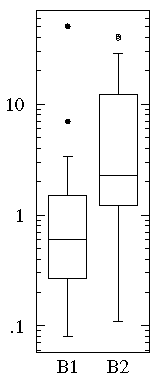
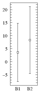
B1={1.26, 0.34, 0.70, 1.75, 50.57, 1.55, 0.08, 0.42, 0.50, 3.20, 0.15, 0.49, 0.95, 0.24, 1.37, 0.17, 6.98, 0.10, 0.94, 0.38}
B2= {2.37, 2.16, 14.82, 1.73, 41.04, 0.23, 1.32, 2.91, 39.41, 0.11, 27.44, 4.51, 0.51, 4.50, 0.18, 14.68, 4.66, 1.30, 2.06, 1.19}
Notice that the datasets span much the same range of values (from about .1 to about 50) and that all the values are positive. Most of the B1 values are less than one whereas most of the B2 values are more than one. We can use a log scale to better display this large range of values:
On the other hand, a straightforward plot of the sample means and population standard deviations, suggests negative values (which prevents use of a log-scale) and broad overlap between the two distributions. (A t-test would suggest B1 and B2 are not significantly different.)
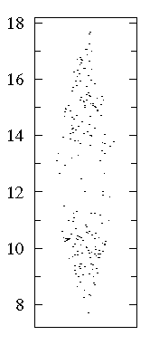
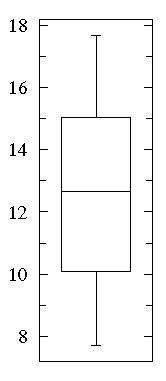
A "bee swarm" plot shows that in this dataset there are lots of data near 10 and 15 but relatively few in between. See that a box plot would not give you any evidence of this.