Click here for boxplots of one or more datasets
Click here for cumulative fraction or percentile plots of one dataset
Click here for cumulative fraction or percentile plots of two datasets as a part of the KS-test
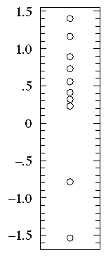
If you have a small dataset, each individual data-point can be displayed which, of course, fully shows the distribution of data. Here are 10 data-points sampled from a normal distribution:
However, with more numerous datasets, the point symbols will overlap making the full display of every data point difficult to interpret. These effects can be mitigated by using smaller point symbols and by randomly "jittering" them to spread them out in the horizontal direction. Here are 100 data-points sampled from a normal distribution:
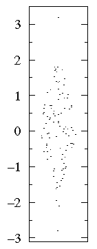
Clearly even this "bee swarm" approach to full disclosure of the dataset has its limits and we must seek some other approach to displaying the distribution of data.
Descriptive statistics are used to summarize the distribution of our data. For example, our measurements of the size of 100 maple leaves might be summarized by reporting a typical value and a range of variation. This data can be reported in the form of a plot with "error bars". For example, if 100 maple leaves were collected from three different sites (parking lots, prairie, and the woods) we can display typical values and ranges of variation:
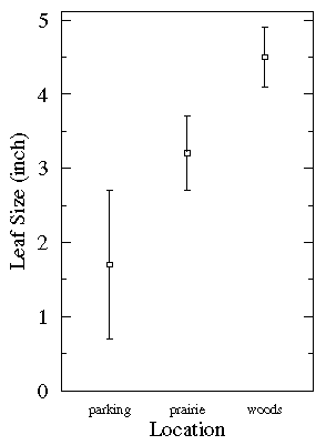
This plot shows that the typical leaf from parking lots was small, but there was
a lot of variation. It is likely that the largest parking lot leaf
was larger than the smallest prairie leaf.
Note that there really isn't a standard meaning for the size of an
error bar. Common choices are: 1 This simplest possible box plot displays the full range of
variation (from min to max), the likely range of variation
(the IQR), and a typical value (the median). Not uncommonly
real datasets will display surprisingly high maximums or
surprisingly low minimums called outliers.
John Tukey has provided a precise definition for two types of
outliers:
If the data happens to be normally distributed,
IQR = 1.35 Suspected outliers are not uncommon in large normally distributed datasets
(say more than 100 data-points).
Outliers are expected in normally distributed
datasets with more than about 10,000 data-points.
Here is an example of 1000 normally distributed
data displayed as a boxplot:
Note that outliers are not necessarily "bad" data-points;
indeed they may well be the most important, most information rich,
part of the dataset. Under no circumstances should they be
automatically removed from the dataset. Outliers may deserve
special consideration: they may be the key to the
phenomenon under study or the result of human blunders.
B1={1.26, 0.34, 0.70, 1.75, 50.57, 1.55, 0.08, 0.42,
0.50, 3.20, 0.15, 0.49, 0.95, 0.24, 1.37,
0.17, 6.98, 0.10, 0.94, 0.38}
If you sort
the B1 dataset from small to large you get:
sorted B1={0.08, 0.10, 0.15, 0.17, 0.24, 0.34, 0.38, 0.42, 0.49,
0.50, 0.70, 0.94, 0.95, 1.26, 1.37, 1.55, 1.75, 3.20, 6.98, 50.57}
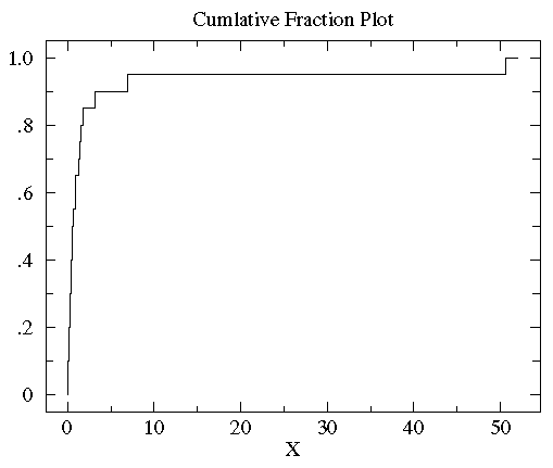
Evidently no data lies strictly below 0.08, 5%=.05=1/20 of the data is strictly
smaller that 0.10, 10%=.10=2/20 of the data is strictly smaller than
0.15, 15%=.15=3/20 of the data is strictly smaller than
0.17... There are 17 data points smaller than You can see with a glance that
the vast majority of the data is scrunched into a small
fraction of the plot on the far left. This is a sign of a non-normal distribution
of the data. In order to better see the data distribution, it would
be nice to scale the x-axis differently, using more space to display
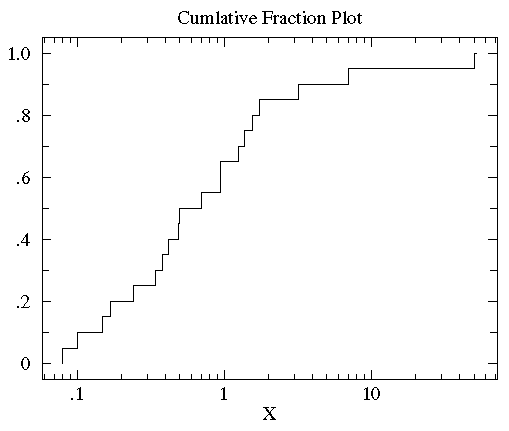
small x data points. Since all the data are positive you can use a "log" scale.
(Since the logarithm of negative numbers and even zero is
undefined, it is not possible to use a log scale if any of the data
are zero or negative.) Since many measured quantities are guaranteed
positive (the width of a leaf, the weight of the mouse, [H+])
log scales are common in science. Here is the result of using a log scale:
You can now see that the median (the point that divides the
data set evenly into two: half above the median, half below the median)
is a bit below 1.
For comparison consider the following dataset, B2:
B2= {2.37, 2.16, 14.82, 1.73, 41.04, 0.23, 1.32, 2.91,
39.41, 0.11, 27.44, 4.51, 0.51, 4.50, 0.18, 14.68,
4.66, 1.30, 2.06, 1.19}
sorted B2= {0.11, 0.18, 0.23, 0.51, 1.19, 1.30, 1.32, 1.73, 2.06,
2.16, 2.37, 2.91, 4.50, 4.51, 4.66, 14.68, 14.82, 27.44, 39.41, 41.04}
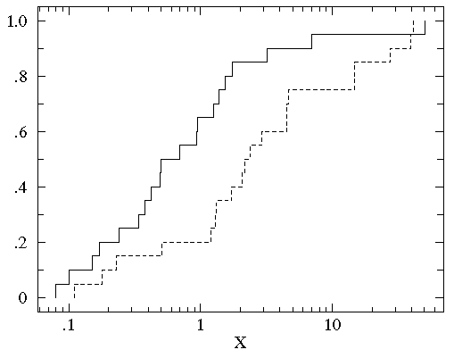
We now plot the cumulative fraction of both groups on the same graph.
(We'll use a solid line to display B1 and a
dashed line to display B2.)
You can see that the datasets span much
the same range of values (from about .1 to about 50). But for most any
x value, the fraction of the B2 group that is strictly less
than x is clearly less than the fraction of the B1 group
that is less than x.
That is, by-and-in-large the B2 values are larger than
the B1 values for the same cumulative fraction. For example,
the median (cumulative fraction =.5) for B1 is clearly
less than one whereas the median for B2 is more than 1.
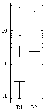
With less detail one can discern the same difference from the
box plots of the two datasets:
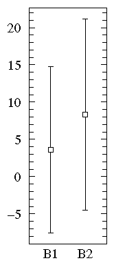
On the other hand, a straightforward plot of the sample means
and population standard deviations, suggests negative values (which prevents
use of a log-scale) and broad overlap between the two
distributions. (A t-test
would suggest B1 and B2 are not significantly different.)
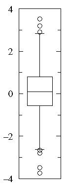
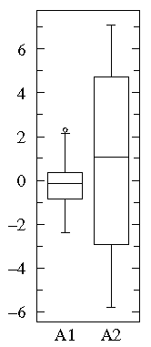
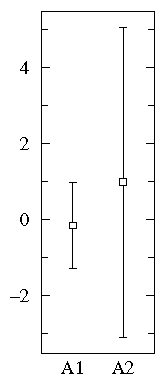
A1={0.22, -0.87, -2.39, -1.79, 0.37, -1.54, 1.28,
-0.31, -0.74, 1.72, 0.38, -0.17, -0.62, -1.10,
0.30, 0.15, 2.30, 0.19, -0.50, -0.09}
A2={-5.13, -2.19, -2.43, -3.83, 0.50, -3.25, 4.32,
1.63, 5.18, -0.43, 7.11, 4.87, -3.10, -5.81,
3.76, 6.31, 2.58, 0.07, 5.76, 3.50}
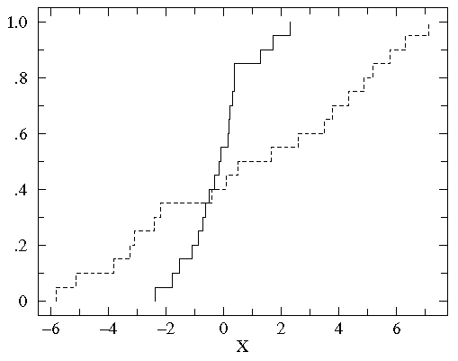
In this case all three display methods tell much the same story:
Notice that both datasets are approximately balanced around
zero; evidently the mean in both cases is "near" zero.
However there is substantially more variation in
A2 which ranges approximately from -6 to 6
whereas A1 ranges approximately from -2½ to 2½.
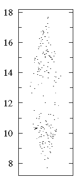
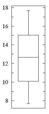
The "bee swarm" plot shows that there are lots of data near 10 and 15
but relatively few in between. See that a box plot would not give you
any evidence of this.
A cumulative fraction plot shows the number of points included increases
rapidly near 10 and 15, whereas there are hardly any new points between
12 and 13.
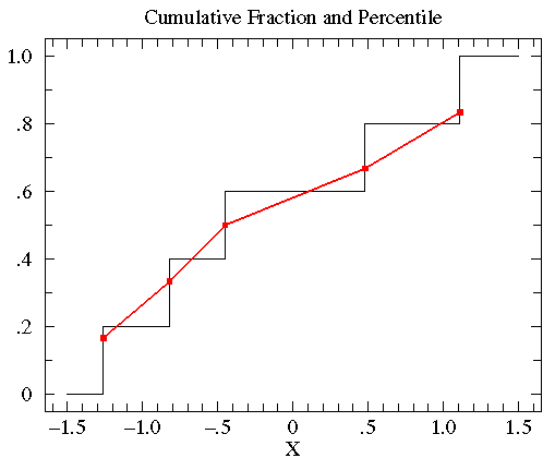
{-0.45, 1.11, 0.48, -0.82, -1.26}
we can sort this data from smallest to largest:
{ -1.26, -0.82, -0.45, 0.48, 1.11 }
The exact middle data-point (-0.45) is called the median, but
it is also the 50th-percentile or percentile=.50. Note that
at x=-0.45 the cumulative fraction makes a step from .4 to .6.
The percentile value will always lie somewhere in the step region.
In general the percentile is calculated from the point's
location in the sorted dataset, r, divided
by the number of data-points plus one (N+1).
Thus in the above example, the percentile for -.45 is 3/6=.5.
In summary:
percentile = r/(N+1)
Thus we have the following set of (datum,percentile) pairs:
{ (-1.26,.167), (-0.82,.333), (-0.45,.5), (0.48,.667), (1.11,.833) }
We can connect adjacent data points with a straight line.
(The resulting collection of connected straight line segments
is called a ogive.)
The below plot compares the percentile plot (red) to the
cumulative fraction.
There are a couple of reasons for preferring percentile
plots to cumulative fractions plots. It turns out that
the percentile plot is a better estimate of the distribution
function (if you know what that is). And plotting percentiles
allows you to use "probability graph paper"...plots with
specially scaled axis divisions. Probability scales
on the y-axis allows you to see how "normal" the data is.
Normally distributed data will plot as a straight line on
probability paper. Lognormal data will plot as a straight line
with probability-log scaled axes. (Incidently uniformly distributed
data will plot as a straight line using the usual linear y-scale.)
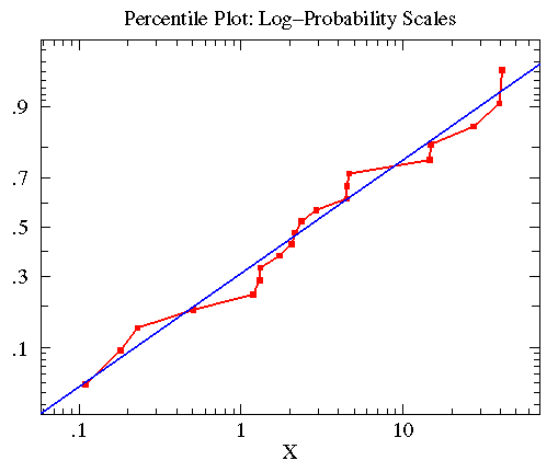
The B2 data
was approximately lognormal with geometric mean of
2.563 and multiplicative standard deviation of 6.795.
In the below plot, I display the percentile plot of this data
(in red) along with the behavior expected for the above
lognormal distribution (in blue).
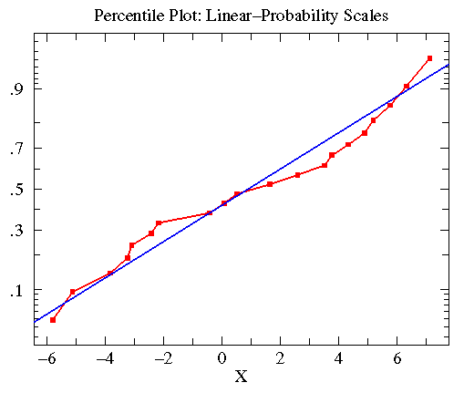
Similar consideration of the A2 data leads to
the following plot. Here the data was approximately
normally distributed with mean=.8835 and standard deviation=4.330
(plotted in blue).
 (the range
would include about 68% of normal data), 2 which is
basically the same as 95% limits, and 0.674×
which would include 50% of normal data. The above
may be a population standard deviation or a standard deviation of the
mean. Because of this lack of standard practice it is critical for the
text or figure caption to report the meaning of the error bar. (In my above
example, I mean the error bar to be 1 for the population.)
(the range
would include about 68% of normal data), 2 which is
basically the same as 95% limits, and 0.674×
which would include 50% of normal data. The above
may be a population standard deviation or a standard deviation of the
mean. Because of this lack of standard practice it is critical for the
text or figure caption to report the meaning of the error bar. (In my above
example, I mean the error bar to be 1 for the population.)
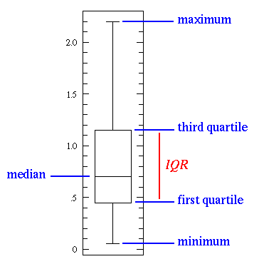
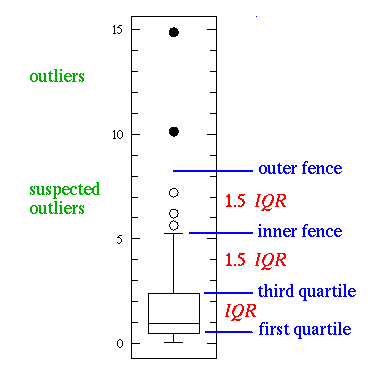
Box Plot
The box plot (a.k.a. box and whisker diagram) is a standardized way
of displaying the distribution of data based on the five number
summary: minimum, first quartile, median, third quartile, and
maximum. In the simplest box plot the central rectangle spans
the first quartile to the third quartile (the interquartile
range or IQR). A segment inside the rectangle
shows the median and "whiskers" above and below the box show the locations
of the minimum and maximum.
If either type of outlier
is present the whisker on the appropriate side is taken to
1.5×IQR from the quartile (the "inner fence") rather
than the max or min, and individual
outlying data points are displayed as unfilled circles
(for suspected outliers) or filled circles
(for outliers). (The "outer fence" is
3×IQR from the quartile.)
Cumulative Fraction Function
Empirical Distribution Function
The cumulative fraction function and the
empirical distribution function are two names for the same thing:
a graphical display of how the data is distributed. Consider
the dataset B1:
 , and hence
we'd say that the cumulative fraction of the data smaller
than is .85=17/20. For any number x,
the cumulative fraction
is the fraction of the data that is strictly smaller than x.
We can plot the function by placing the cumulative fraction (a number between
0 and 1) on the y-axis and the data-comparison value on the
x-axis. For example, the y value of the curve will be
the constant 17/20=.85 for x values between 1.75 and 3.20, because
17 of the 20 data-points are smaller than those values of x. The curve's
y value will jump to 18/20=.9 for x between 3.20 and 6.98, because
18 of the 20 data-points are smaller than those values of x.
Below is the plot of the cumulative fraction for our B1
data. Each step in the plot corresponds to a data-point.
, and hence
we'd say that the cumulative fraction of the data smaller
than is .85=17/20. For any number x,
the cumulative fraction
is the fraction of the data that is strictly smaller than x.
We can plot the function by placing the cumulative fraction (a number between
0 and 1) on the y-axis and the data-comparison value on the
x-axis. For example, the y value of the curve will be
the constant 17/20=.85 for x values between 1.75 and 3.20, because
17 of the 20 data-points are smaller than those values of x. The curve's
y value will jump to 18/20=.9 for x between 3.20 and 6.98, because
18 of the 20 data-points are smaller than those values of x.
Below is the plot of the cumulative fraction for our B1
data. Each step in the plot corresponds to a data-point.
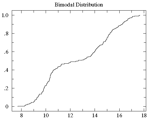
Consider now another example of distribution display:
One case of particular concern is when the data is distributed
into "two lumps" rather than the "one lump" cases we've considered so far.
Percentile Plot
Estimated Distribution Function Ogive
related keyword: Order Statistics
The steps of the cumulative fraction plot look strange to our
eyes: we are used to seeing continuous curves. Of course the
steps are exactly correct: just above a data-point there is
one more included data-point and hence
a bit more cumulative fraction then just below a data-point.
We seek something quite similar to cumulative fraction, but
without the odd steps. Percentile is a very
similar idea to cumulative fraction. If we have a dataset
with five data-points:
Histograms
Consider again the bimodal dataset discussed above.
We found that data clustered around 10 and 15; that is,
there were lots of points in the range of 10 to 11 and 14 to 15,
but fewer points in similar ranges (for example 12 to 13 or 7 to 8
or 17 to 18). We can make this explicit by counting the number
of data in various "bins", i.e., ranges.
| Range: | 7-8 | 8-9 | 9-10 | 10-11 | 11-12 | 12-13 | 13-14 | 14-15 | 15-16 | 16-17 | 17-18 |
|---|---|---|---|---|---|---|---|---|---|---|---|
| Count: | 1 | 8 | 37 | 41 | 9 | 6 | 19 | 29 | 27 | 17 | 6 |
A plot of the count-in-bin vs the bin-location is called a histogram.
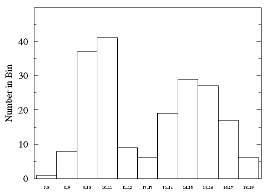
Histograms have the great advantage of showing exactly which ranges are highly populated and which are not. However, the count in a particular bin will generally vary if a new set of data is collected. We can estimate this variation in count by applying Poisson statistics: the variation in count will generally be comparable to the square root of the count. If we express this likely variation as an error bar, the result is:
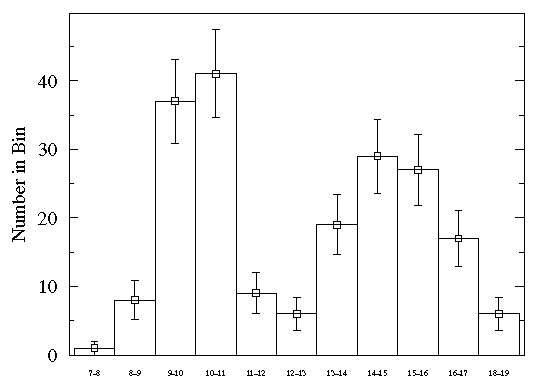
From the relatively large size of the error bars you can see that a lot of variation is expected in this histogram. (Nevertheless note that the expected variation will not wash out the two-humped distribution.) As an approximate rule of thumb, expect that around 1000 data-points are needed for a relatively accurate histogram. The above somewhat crude histogram used 200 data-points.
In constructing a histogram you must choose the bins. Narrow bins will collect few data-points and will therefore show relatively large variation. Large bins may lump together different regions which are really different, thus distorting (muting) the real distribution of the data. Obviously the choice of bins affords you the opportunity to Lie with Statistics.
Most commonly bins are chosen to be equally sized. However, this is not a requirement. When using non-uniform bin size, plot the probability density:
probability density = (fraction of data in bin)/(bin size)
Note that since the fraction of data in a bin will be the difference in the cumulative fraction at either side of the bin, the probability density is the slope of the secant line that connects the bin sides on a cumulative fraction plot (slope = rise/run). Approximately speaking, the histogram plot is the derivative of the cumulative fraction plot. Large histogram values (i.e., highly populated bins) correspond to regions of high slope on the cumulative fraction curve.